New research on social media during the 2020 election, and my predictions
This is crossposted from Statistical Modeling, Causal Inference, and Social Science.
Back in 2020, leading academics and researchers at the company now known as Meta put together a large project to study social media and the 2020 US elections — particularly the roles of Instagram and Facebook. As Sinan Aral and I had written about how many paths for understanding effects of social media in elections could require new interventions and/or platform cooperation, this seemed like an important development. Originally the idea was for this work to be published in 2021, but there have been some delays, including simply because some of the data collection was extended as what one might call “election-related events” continued beyond November and into 2021. As of 2pm Eastern today, the news embargo for this work has been lifted on the first group of research papers.
I had heard about this project back a long time ago and, frankly, had largely forgotten about it. But this past Saturday, I was participating in the SSRC Workshop on the Economics of Social Media and one session was dedicated to results-free presentations about this project, including the setup of the institutions involved and the design of the research. The organizers informally polled us with qualitative questions about some of the results. This intrigued me. I had recently reviewed an unrelated paper that included survey data from experts and laypeople about their expectations about the effects estimated in a field experiment, and I thought this data was helpful for contextualizing what “we” learned from that study.
So I thought it might be useful, at least for myself, to spend some time eliciting my own expectations about the quantities I understood would be reported in these papers. I’ve mainly kept up with the academic and grey literature, I’d previously worked in the industry, and I’d reviewed some of this for my Senate testimony back in 2021. Along the way, I tried to articulate where my expectations and remaining uncertainty were coming from. I composed many of my thoughts on my phone Monday while taking the subway to and from the storage unit I was revisiting and then emptying in Brooklyn. I got a few comments from Solomon Messing and Tom Cunningham, and then uploaded my notes to OSF and posted a cheeky tweet.
Since then, starting yesterday, I’ve spoken with journalists and gotten to view the main text of papers for two of the randomized interventions for which I made predictions. These evaluated effects of (a) switching Facebook and Instagram users to a (reverse) chronological feed, (b) removing “reshares” from Facebook users’ feeds, and (c) downranking content by “like-minded” users, Pages, and Groups.
My guesses
My main expectations for those three interventions could be summed up as follows. These interventions, especially chronological ranking, would each reduce engagement with Facebook or Instagram. This makes sense if you think the status quo is somewhat-well optimized for showing engaging and relevant content. So some of the rest of the effects — on, e.g., polarization, news knowledge, and voter turnout — could be partially inferred from that decrease in use. This would point to reductions in news knowledge, issue polarization (or coherence/consistency), and small decreases in turnout, especially for chronological ranking. This is because people get some hard news and political commentary they wouldn’t have otherwise from social media. These reduced-engagement-driven effects should be weakest for the “soft” intervention of downranking some sources, since content predicted to be particularly relevant will still make it into users’ feeds.
Besides just reducing Facebook use (and everything that goes with that), I also expected swapping out feed ranking for reverse chron would expose users to more content from non-friends via, e.g., Groups, including large increases in untrustworthy content that would normally rank poorly. I expected some of the same would happen from removing reshares, which I expected would make up over 20% of views under the status quo, and so would be filled in by more Groups content. For downranking sources with the same estimated ideology, I expected this would reduce exposure to political content, as much of the non-same-ideology posts will be by sources with estimated ideology in the middle of the range, i.e. [0.4, 0.6], which are less likely to be posting politics and hard news. I’ll also note that much of my uncertainty about how chronological ranking would perform was because there were a lot of unknown but important “details” about implementation, such as exactly how much of the ranking system really gets turned off (e.g., how much likely spam/scam content still gets filtered out in an early stage?).
How’d I do?
Here’s a quick summary of my guesses and the results in these three papers:
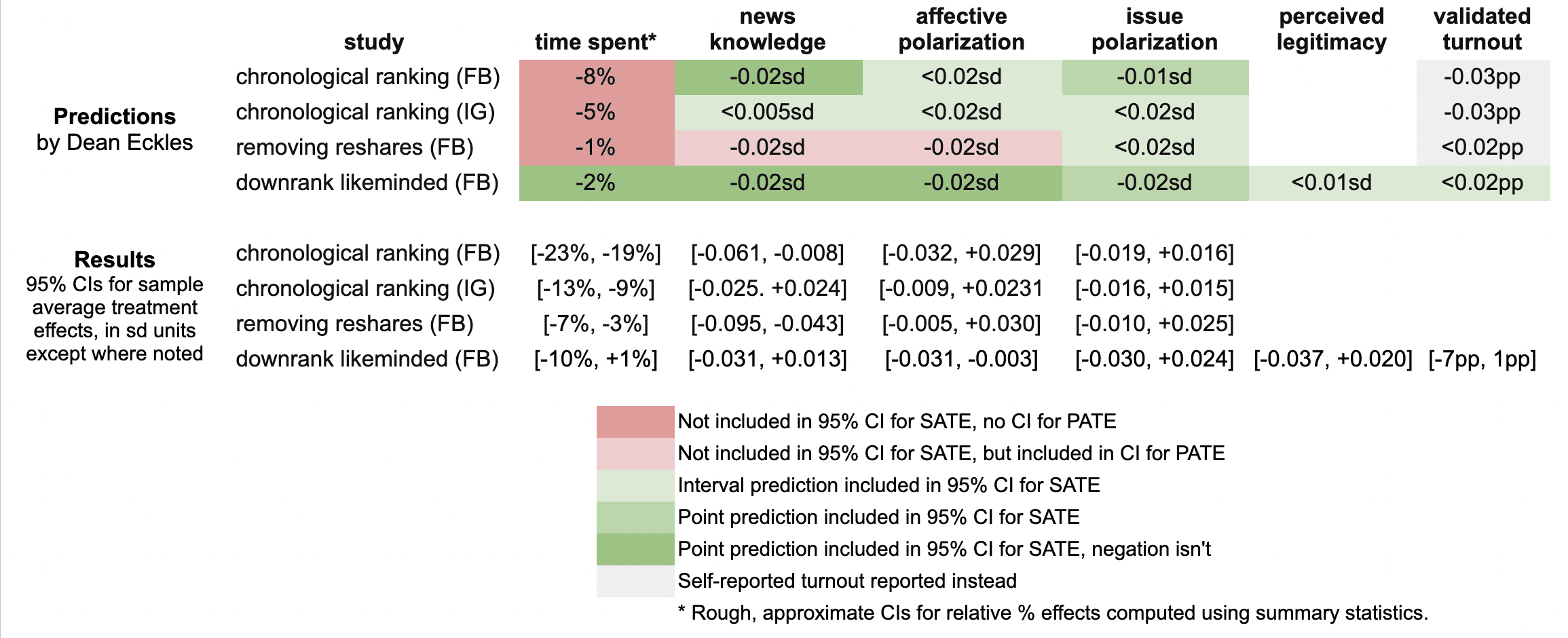
It looks like I was wrong in that the reductions in engagement were larger than I predicted: e.g., chronological ranking reduced time spent on Facebook by 21%, rather than the 8% I guessed, which was based on my background knowledge, a leaked report on a Facebook experiment, and this published experiment from Twitter.
Ex post I hypothesize that this is because of the duration of these experiments allowed for continual declines in use over months, with various feedback loops (e.g., users with chronological feed log in less, so they post less, so they get fewer likes and comments, so they log in even less and post even less). As I dig into the 100s of pages of supplementary materials, I’ll be looking to understand what these declines looked like at earlier points in the experiment, such as by election day.
My estimates for the survey-based outcomes of primary interest, such as polarization, were mainly covered by the 95% confidence intervals, with the exception of two outcomes from the “no reshares” intervention.
One thing is that all these papers report weighted estimates for a broader population of US users (population average treatment effects, PATEs), which are less precise than the unweighted (sample average treatment effect, SATE) results. Here I focus mainly on the unweighted results, as I did not know there was going to be any weighting and these are also the more narrow, and thus riskier, CIs for me. (There seems to have been some mismatch between the outcomes listed in the talk I saw and what’s in the papers, so I didn’t make predictions for some reported primary outcomes and some outcomes I made predictions for don’t seem to be reported, or I haven’t found them in the supplements yet.)
Now is a good time to note that I basically predicted what psychologists armed with Jacob Cohen’s rules of thumb might call extrapolate to “minuscule” effect sizes. All my predictions for survey-based outcomes were 0.02 standard deviations or smaller. (Recall Cohen’s rules of thumb say 0.1 is small, 0.5 medium, and 0.8 large.)
Nearly all the results for these outcomes in these two papers were indistinguishable from the null (p > 0.05), with standard errors for survey outcomes at 0.01 SDs or more. This is consistent with my ex ante expectations that the experiments would face severe power problems, at least for the kind of effects I would expect. Perhaps by revealed preference, a number of other experts had different priors.
A rare p < 0.05 result is that that chronological ranking reduced news knowledge by 0.035 SDs with 95% CI [-0.061, -0.008], which includes my guess of -0.02 SDs. Removing reshares may have reduced news knowledge even more than chronological ranking — and by more than I guessed.
Even with so many null results I was still sticking my neck out a bit compared with just guessing zero everywhere, since in some cases if I had put the opposite sign my estimate wouldn’t have been in the 95% CI. For example, downranking “like-minded” sources produced a CI of [-0.031, 0.013] SDs, which includes my guess of -0.02, but not its negation. On the other hand, I got some of these wrong, where I guessed removing reshares would reduce affective polarization, but a 0.02 SD effect is outside the resulting [-0.005, +0.030] interval.
It was actually quite a bit of work to compare my predictions to the results because I didn’t really know a lot of key details about exact analyses and reporting choices, which strikingly even differ a bit across these three papers. So I might yet find more places where I can, with a lot of reading and a bit of arithmetic, figure out where else I may have been wrong. (Feel free to point these out.)
Further reflections
I hope that this helps to contextualize the present results with expert consensus — or at least my idiosyncratic expectations. I’ll likely write a bit more about these new papers and further work released as part of this project.
It was probably an oversight for me not to make any predictions about the observational paper looking at polarization in exposure and consumption of news media. I felt like I had a better handle on thinking about simple treatment effects than these measures, but perhaps that was all the more reason to make predictions. Furthermore, given the limited precision of the experiments’ estimates, perhaps it would have been more informative (and riskier) to make point predictions about these precisely estimated observational quantities.
[I want to note that I was an employee or contractor of Facebook (now Meta) from 2010 through 2017. I have received funding for other research from Meta, Meta has sponsored a conference I organize, and I have coauthored with Meta employees as recently as earlier this month. I was also recently a consultant to Twitter, ending shortly after the Musk acquisition. You can find all my disclosures here.]
Total war, and armaments as “superior goods”
Hobsbawn on industrialization, mass mobilization, and “total war” in The Age of Extremes: A History of the World, 1914-1991 (ch. 1):
Jane Austen wrote her novels during the Napoleonic wars, but no reader who did not know this already would guess it, for the wars do not appear in her pages, even though a number of the young gentlemen who pass through them undoubtedly took part in them. It is inconceivable that any novelist could write about Britain in the twentieth-century wars in this manner.
The monster of twentieth-century total war was not born full-sized. Nevertheless, from 1914 on, wars were unmistakably mass wars. Even in the First World War Britain mobilized 12.5 per cent of its men for the forces, Germany 15.4 per cent, France almost 17 per cent. In the Second World War the percentage of the total active labour force that went into the armed forces was pretty generally in the neighborhood of 20 per cent (Milward, 1979, p. 216). We may note in passing that such a level of mass mobilization, lasting for a matter of years, cannot be maintained except by a modern high-productivity industrialized economy, and – or alternatively – an economy largely in the hands of the non-combatant parts of the population. Traditional agrarian economies cannot usually mobilize so large a proportion of their labour force except seasonally, at least in the temperate zone, for there are times in the agricultural year when all hands are needed (for instance to get in the harvest). Even in industrial societies so great a manpower mobilization puts enormous strains on the labour force, which is why modern mass wars both strengthened the powers of organized labour and produced a revolution in the employment of women outside the household: temporarily in the First World War, permanently in the Second World War.
A superior good is something that one purchases more of as income rises. Here it is appealing to, at least metaphorically, see the huge expenditures on industrial armaments as revealing arms as superior goods in this sense.
It’s better for older workers to go a little fast: DocSend in Snow Crash
My friends at DocSend have just done their public launch (article, TechCrunch Disrupt presentation). DocSend provides easy ways to get analytics for documents (e.g., proposals, pitch decks, reports, memos) you send out, answering questions like: Who actually viewed the document? Which pages did they view? How much time did they spend on each page? The most common use cases for DocSend’s current customers involve sales, marketing, and startup fundraising — mainly sending documents to people outside an organization.
From when Russ, Dave, and Tony started floating these ideas, I’ve pointed out the similarity with a often forgotten scene1 in Snow Crash, in which a character — Y.T.’s mom — is tracked by her employer (the Federal Government actually) as she reads a memo on a cost-saving program. Here’s an except from Chapter 37:
Y.T.’s mom pulls up the new memo, checks the time, and starts reading it. The estimated reading time is 15.62 minutes. Later, when Marietta [her boss] does her end-of-day statistical roundup, sitting in her private office at 9:00 P.M., she will see the name of each employee and next to it, the amount of time spent reading this memo, and her reaction, based on the time spent, will go something like this:
• Less than 10 min.: Time for an employee conference and possible attitude counseling.
• 10-14 min.: Keep an eye on this employee; may be developing slipshod attitude.
• 14-15.61 min.: Employee is an efficient worker, may sometimes miss important details.
• Exactly 15.62 min.: Smartass. Needs attitude counseling.
• 15.63-16 min.: Asswipe. Not to be trusted.
• 16-18 min.: Employee is a methodical worker, may sometimes get hung up on minor details.
• More than 18 min.: Check the security videotape, see just what this employee was up to (e.g., possible unauthorized restroom break).
Y.T.’s mom decides to spend between fourteen and fifteen minutes reading the memo. It’s better for younger workers to spend too long, to show that they’re careful, not cocky. It’s better for older workers to go a little fast, to show good management potential. She’s pushing forty. She scans through the memo, hitting the Page Down button at reasonably regular intervals, occasionally paging back up to pretend to reread some earlier section. The computer is going to notice all this. It approves of rereading. It’s a small thing, but over a decade or so this stuff really shows up on your work-habits summary.
This is pretty much what DocSend provides. And, despite the emphasis on sales etc., some of their customers are using this for internal HR training — which shifts the power asymmetry in how this technology is used from salespeople selling to companies (which can choose not to buy, etc.) to employers tracking their employees.2
To conclude, it’s worth noting that, at least for a time, product managers at Facebook — Russ’ job before starting DocSend — were required to read Snow Crash as part of their internal training. Though I don’t think the folks running PM bootcamp actually tracked whether their subordinates looked at each page.
- I know it’s often forgotten because I’ve tried referring to the scene with many people who have read Snow Crash— or at least claim to have read it… [↩]
- Of course, there are some products that do this kind of thing. What distinguishes DocSend is how easy it makes it to add such personalized tracking to simple documents and that this is the primary focus of the product, unlike larger sales tool sets like ClearSlide. [↩]
Exploratory data analysis: Our free online course
Moira Burke, Solomon Messing, Chris Saden, and I have created a new online course on exploratory data analysis (EDA) as part of Udacity’s “Data Science” track. It is designed to teach students how to explore data sets. Students learn how to do EDA using R and the visualization package ggplot.
We emphasize the value of EDA for building and testing intuitions about a data set, identifying problems or surprises in data, summarizing variables and relationships, and supporting other data analysis tasks. The course materials are all free, and you can also sign up for tutoring, grading (especially useful for the final project), and certification.
Between providing general advice on data analysis and visualization, stepping students through exactly how to produce particular plots, and reasoning about how the data can answer questions of interest, the course includes interviews with four of our amazing colleagues on the Facebook Data Science team:
- Aude Hofleitner shares the process behind research on coordinated migration using hometown and “current city” Facebook data. (Udacity, YouTube)
- Lada Adamic gives an example of the importance of considering transformations of both x- and y-axes in an analysis from our forthcoming paper on the spread of rumors, memes, and urban legends on Facebook. (Udacity, YouTube)
- Sean Taylor illustrates the bias–variance tradeoff and other modeling decisions in his work on sentiment expressed by NFL (American football) fans. (Udacity, YouTube)
- Eytan Bakshy provides advice and encouragement to people working to become a “data scientist” (whatever that is). (Udacity, YouTube)
One unique feature of this course is that one of the data sets we use is a “pseudo-Facebook” data set that Moira and I created to share many features with real Facebook data, but to not describe any particular real Facebook users or reveal certain kinds of information about aggregate behavior. Other data sets used in the course include two different data sets giving sale prices for diamonds and panel “scanner” data describing yogurt purchases.
It was an fascinating and novel process putting together this course. We scripted almost everything in detail in advance — before any filming started — using first outlines, then drafts using Markdown in R with knitr, and then more detailed scripts with Udacity-specific notation for all the different shots and interspersed quizzes. I think this is part of what leads Kaiser Fung to write:
The course is designed from the ground up for online instruction, and it shows. If you have tried other online courses, you will immediately notice the difference in quality.
Check out the course and let me know what you think — we’re still incorporating feedback.
Producing, consuming, annotating (Social Mobile Media Workshop, Stanford University)
Today I’m attending the Social Mobile Media Workshop at Stanford University. It’s organized by researchers from Stanford’s HStar, Tampere University of Technology, and the Naval Postgraduate School. What follows is some still jagged thoughts that were prompted by the presentation this morning, rather than a straightforward account of the presentations.1
A big theme of the workshop this morning has been transitions among production and consumption — and the critical role of annotations and context-awareness in enabling many of the user experiences discussed. In many ways, this workshop took me back to thinking about mobile media sharing, which was at the center of a good deal of my previous work. At Yahoo! Research Berkeley we were informed by Marc Davis’s vision of enabling “the billions of daily media consumers to become daily media producers.” With ZoneTag we used context-awareness, sociality, and simplicity to influence people to create, annotate, and share photos from their mobile phones (Ahern et al. 2006, 2007).
Enabling and encouraging these behaviors (for all media types) remains a major goal for designers of participatory media; and this was explicit at several points throughout the workshop (e.g., in Teppo Raisanen’s broad presentation on persuasive technology). This morning there was discussion about the technical requirements for consuming, capturing, and sending media. Cases that traditionally seem to strictly structure and separate production and consumption may be (1) in need of revision and increased flexibility or (2) actually already involve production and consumption together through existing tools. Media production to be part of a two-way communication, it must be consumed, whether by peers or the traditional producers.
As an example of the first case, Sarah Lewis (Stanford) highlighted the importance of making distance learning experiences reciprocal, rather than enforcing an asymmetry in what media types can be shared by different participants. In a past distance learning situation focused on the African ecosystem, it was frustrating that video was only shared from the participants at Stanford to participants at African colleges — leaving the latter to respond only via text. A prototype system, Mobltz, she and her colleagues have built is designed to change this, supporting the creation of channels of media from multiple people (which also reminded me of Kyte.tv).
As an example of the second case, Timo Koskinenen (Nokia) presented a trial of mobile media capture tools for professional journalists. In this case the work flow of what is, in the end, a media production practice, involves also consumption in the form of review of one’s own materials and other journalists, as they edit, consider what new media to capture.
Throughout the sessions themselves and conversations with participants during breaks and lunch, having good annotations continued to come up as a requirement for many of the services discussed. While I think our ZoneTag work (and the free suggested tags Web service API it provides) made a good contribution in this area, as has a wide array of other work (e.g., von Ahn & Dabbish 2004, licensed in Google Image Labeler), there is still a lot of progress to make, especially in bringing this work to market and making it something that further services can build on.
References
Ahern, S., Davis, M., Eckles, D., King, S., Naaman, M., Nair, R., et al. (2006). ZoneTag: Designing Context-Aware Mobile Media Capture. In Adjunct Proc. Ubicomp (pp. 357-366).
Ahern, S., Eckles, D., Good, N. S., King, S., Naaman, M., & Nair, R. (2007). Over-exposed?: privacy patterns and considerations in online and mobile photo sharing. In Proc. CHI 2007 (pp. 357-366). ACM Press.
Ahn, L. V., & Dabbish, L. (2004). Labeling images with a computer game. In Proc. CHI 2004 (pp. 319-326).
- Blogging something at this level of roughness is still new for me… [↩]